HEALTHCARE
Client
HuHealth
team
Delibix
year
2026
role
Product Designer

overview
Two products, one challenge:
building trust through design
HuHealth came to Delibix with a dual brief: design a product dashboard for their health platform, and design the marketing website that would communicate their value to patients, providers, and potential partners in the US market.
The challenge wasn't just visual, it was about trust at the intersection of health and technology. Health data is personal, sensitive, and consequential. The design had to feel authoritative and clear without being cold or clinical. Accessible without being oversimplified. Modern without triggering the "this is not a real medical product" reaction that consumer health apps often provoke. This was the first major US market project under Delibix, and set the standard for how we approach healthtech clients internationally.
Scope
What we designed
02
Marketing Website
Full marketing site: landing page, product overview, pricing, patient testimonials, provider onboarding, and conversion optimization. Designed to rank, convert, and build trust simultaneously.
01
Product Dashboard
Full dashboard design: data visualization, user management, health metrics display, notification system, and settings flows. Designed for both patients and providers with role-based views.
Design Visuals
Dashboard and marketing site, side by side
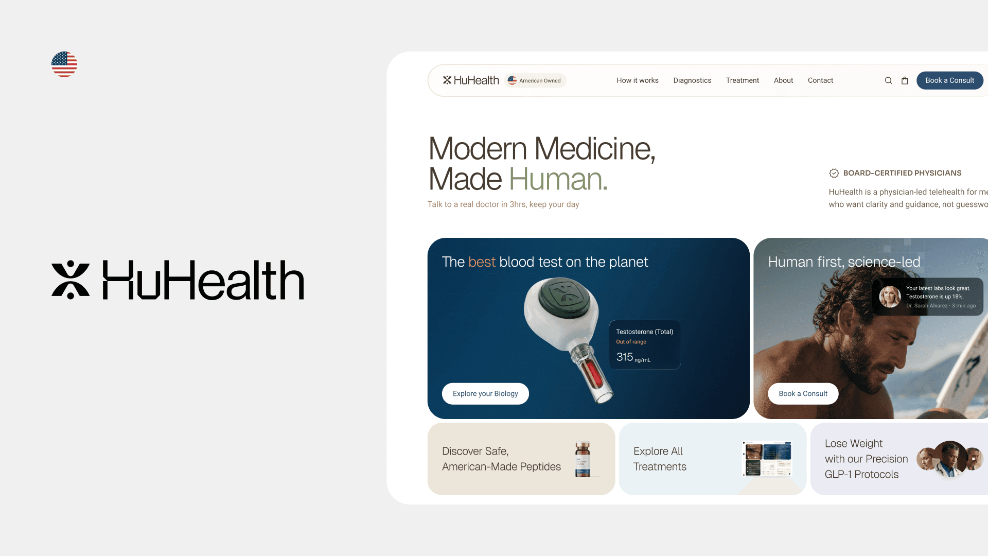
Two products sharing one design language. The provider dashboard surfaces health metrics, patient lists, and trend data with a clinical clarity that doesn't feel cold. The marketing site leads with trust signals and patient outcomes, not product screenshots.
Design Challenges
The specific problems we had to solve
Trust is the product
In health, visual design is not decoration, it communicates competence and reliability. Rough edges, poor hierarchy, or unclear language lose patients before they even sign up.
Health data is dense
Medical metrics, trend charts, and alert states need to be understood instantly by users who are not data analysts, and in some cases, by patients who are anxious.
US market expectations
American healthtech users have high expectations from products like Apple Health, Epic, and modern telehealth apps. The design bar was set by world-class competition.
Multiple audience types
The platform serves patients, healthcare providers, and enterprise partners, each with different literacy levels, goals, and concerns. One design system had to serve all three without confusion.
Design Process
From brief to shipped product
1
Competitive landscape and benchmark
Audited the top US healthtech dashboard and marketing website designs: Apple Health, Epic MyChart, Teladoc, Hinge Health. Identified where HuHealth could differentiate, specifically in warmth and clarity where many competitors were cold and corporate.
2
Information architecture
Mapped the full information hierarchy for both the dashboard and the marketing site. Resolved the tension between what each audience needs to see first versus what the product needs to communicate first.
3
Dashboard design
Designed data-dense, efficient, built for speed. Sharing the same visual language while serving fundamentally different mental models.
4
Marketing website, conversion-focused design
Designed the marketing site with a clear conversion hierarchy: trust-building above the fold, value articulation in the middle, social proof and CTA at the close. Every section had a measurable goal, not just visual intent.
5
Handoff and developer collaboration
Delivered complete Figma files with component annotations, responsive specs, interaction states, and a developer handoff guide. Ran a live handoff session with the engineering team to walk through edge cases.
Key Decisions
Design thinking behind the product
Why the patient dashboard shows fewer metrics, not more
Most healthtech defaults to cold blue and white, it communicates clinical authority but also distance. HuHealth's positioning was warmer and more patient-centric. We chose a color system that felt trustworthy and approachable, informed by research on patient anxiety in digital health contexts.
Why the marketing site leads with patient stories, not features
Conversion research in US healthtech consistently shows that social proof from people who look like the target patient outperforms feature lists. We led with testimonials and outcomes, not product screenshots.
Why we built a shared design system across both products
The dashboard and website needed to feel like the same company. A shared token system meant color, spacing, and typography were consistent across both, giving HuHealth a coherent brand identity from first visit to logged-in experience.
What We Got Wrong
The decisions I'd revisit, and what they taught me
Not everything worked. These are three decisions I'd make differently if we started over.
Direction rejected
We designed the provider dashboard to be as data-dense as possible, and it was too much
My assumption was that healthcare providers are power users who want everything on one screen. Wrong. Providers are context-switching constantly, between patients, paperwork, and conversations. The initial dense layout required too much cognitive effort to scan. We had to pull back significantly and introduce progressive disclosure: a summary card first, detail on demand. The principle I'd applied, "more data for expert users", was valid, but I'd misread who the actual expert user was in that context.
Assumption that failed
We assumed the marketing site's primary job was conversion. It wasn't, it was credibility.
The first version of the marketing site was optimized hard for conversion: clear CTA above the fold, minimal distraction, feature-forward. The client's feedback was that it felt like every other SaaS landing page, generic, pressuring, nothing that signaled "this is different from the other health apps I've tried and abandoned." We had to rebuild the emotional architecture of the page. Lead with what the product actually changes for a patient, not just what features it has. That shift required scrapping a full section of work, which is always uncomfortable, but it was right.
Timing regret
We built the design system after starting some screens, and paid for it
Under timeline pressure, I started designing dashboard screens before the component library was complete. The result: inconsistencies that had to be cleaned up retroactively, different spacing patterns, slight color drift, icon sizes that didn't match. This added friction at handoff and cost us time we didn't have. The lesson was relearned: building the system first always costs less than retrofitting consistency later, even if it feels slower at the start.
Outcome
What shipped
Both products shipped in 2026 as part of HuHealth's US market launch under the Delibix engagement. The dashboard and marketing website went live together, giving HuHealth a coherent end-to-end product and brand presence.
ReflectioN
What designing for the US market teaches you
Working with a US healthtech client exposed me to a design environment with extremely high baseline expectations. The competitive set, Apple, Epic, Teladoc, has set a standard where anything below world-class feels amateurish.
The most important shift was understanding that in health design, clarity is a safety feature, not an aesthetic preference. Confusing data display doesn't just frustrate users, it can cause them to make wrong decisions about their health. That weight changes how you approach every design choice.
The principle I took from this project