LAYANAN KESEHATAN

overview
Dua produk, satu tantangan:
membangun kepercayaan melalui desain
HuHealth datang ke Delibix dengan dua tugas: mendesain dasbor produk untuk platform kesehatan mereka, dan mendesain situs web pemasaran yang akan mengomunikasikan nilai mereka kepada pasien, penyedia layanan, dan mitra potensial di pasar AS.
Tantangannya bukan hanya visual, ini tentang kepercayaan di persimpangan jalan antara kesehatan dan teknologi. Data kesehatan bersifat pribadi, sensitif, dan memiliki konsekuensi penting. Desainnya harus terasa berwibawa dan jelas tanpa terkesan dingin atau klinis. Mudah diakses tanpa disederhanakan secara berlebihan. Modern tanpa memicu reaksi "ini bukan produk medis asli" yang sering kali ditimbulkan oleh aplikasi kesehatan konsumen. Ini adalah proyek pasar AS besar pertama di bawah Delibix, dan menetapkan standar tentang bagaimana kami mendekati klien healthtech secara internasional.
Situation
Apa yang kami desain
02
Marketing Website
Full marketing site: landing page, product overview, pricing, patient testimonials, provider onboarding, and conversion optimization. Designed to rank, convert, and build trust simultaneously.
01
Product Dashboard
Full dashboard design: data visualization, user management, health metrics display, notification system, and settings flows. Designed for both patients and providers with role-based views.
Design Visuals
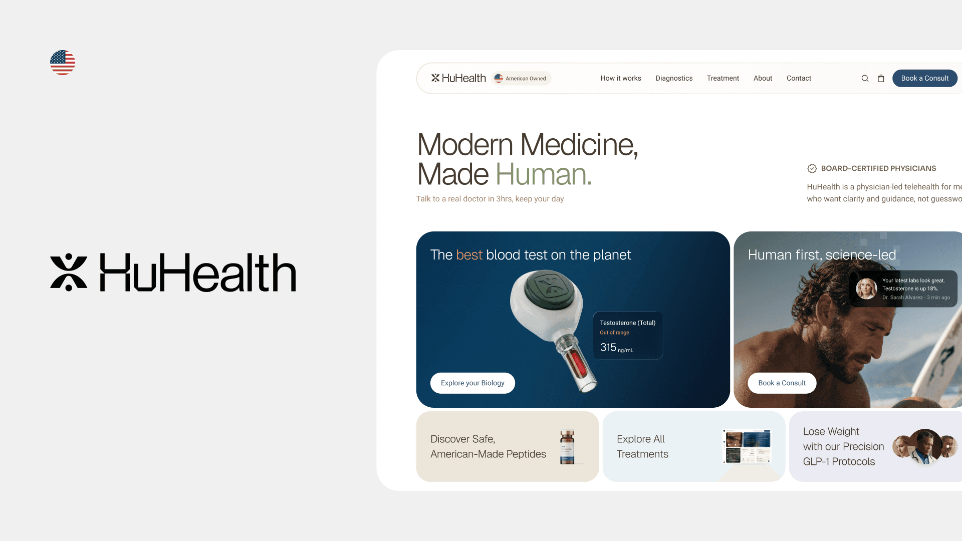
Dasbor dan situs pemasaran, berdampingan
Dua produk yang berbagi satu bahasa desain. Dasbor penyedia layanan menampilkan metrik kesehatan, daftar pasien, dan data tren dengan kejelasan klinis yang tidak terasa dingin. Situs pemasaran mengutamakan sinyal kepercayaan dan hasil kesehatan pasien, bukan tangkapan layar produk.
Design Challenges
Masalah spesifik yang harus kami selesaikan
Trust is the product
In health, visual design is not decoration, it communicates competence and reliability. Rough edges, poor hierarchy, or unclear language lose patients before they even sign up.
Health data is dense
Medical metrics, trend charts, and alert states need to be understood instantly by users who are not data analysts, and in some cases, by patients who are anxious.
US market expectations
American healthtech users have high expectations from products like Apple Health, Epic, and modern telehealth apps. The design bar was set by world-class competition.
Multiple audience types
The platform serves patients, healthcare providers, and enterprise partners, each with different literacy levels, goals, and concerns. One design system had to serve all three without confusion.
Design Process
Dari konsep hingga produk yang siap diluncurkan
1
Competitive landscape and benchmark
Audited the top US healthtech dashboard and marketing website designs: Apple Health, Epic MyChart, Teladoc, Hinge Health. Identified where HuHealth could differentiate, specifically in warmth and clarity where many competitors were cold and corporate.
2
Information architecture
Mapped the full information hierarchy for both the dashboard and the marketing site. Resolved the tension between what each audience needs to see first versus what the product needs to communicate first.
3
Dashboard design
Designed data-dense, efficient, built for speed. Sharing the same visual language while serving fundamentally different mental models.
4
Marketing website, conversion-focused design
Designed the marketing site with a clear conversion hierarchy: trust-building above the fold, value articulation in the middle, social proof and CTA at the close. Every section had a measurable goal, not just visual intent.
5
Handoff and developer collaboration
Delivered complete Figma files with component annotations, responsive specs, interaction states, and a developer handoff guide. Ran a live handoff session with the engineering team to walk through edge cases.
Key Decisions
Pemikiran desain di balik produk
Why the patient dashboard shows fewer metrics, not more
Most healthtech defaults to cold blue and white, it communicates clinical authority but also distance. HuHealth's positioning was warmer and more patient-centric. We chose a color system that felt trustworthy and approachable, informed by research on patient anxiety in digital health contexts.
Why the marketing site leads with patient stories, not features
Conversion research in US healthtech consistently shows that social proof from people who look like the target patient outperforms feature lists. We led with testimonials and outcomes, not product screenshots.
Why we built a shared design system across both products
The dashboard and website needed to feel like the same company. A shared token system meant color, spacing, and typography were consistent across both, giving HuHealth a coherent brand identity from first visit to logged-in experience.
What We Got Wrong
Keputusan yang ingin saya tinjau kembali, dan apa yang diajarkannya kepada saya
Tidak semuanya berjalan lancar. Ini adalah tiga keputusan yang akan saya buat secara berbeda jika kami memulai dari awal.
Direction rejected
We designed the provider dashboard to be as data-dense as possible, and it was too much
My assumption was that healthcare providers are power users who want everything on one screen. Wrong. Providers are context-switching constantly, between patients, paperwork, and conversations. The initial dense layout required too much cognitive effort to scan. We had to pull back significantly and introduce progressive disclosure: a summary card first, detail on demand. The principle I'd applied, "more data for expert users", was valid, but I'd misread who the actual expert user was in that context.
Assumption that failed
We assumed the marketing site's primary job was conversion. It wasn't, it was credibility.
The first version of the marketing site was optimized hard for conversion: clear CTA above the fold, minimal distraction, feature-forward. The client's feedback was that it felt like every other SaaS landing page, generic, pressuring, nothing that signaled "this is different from the other health apps I've tried and abandoned." We had to rebuild the emotional architecture of the page. Lead with what the product actually changes for a patient, not just what features it has. That shift required scrapping a full section of work, which is always uncomfortable, but it was right.
Timing regret
We built the design system after starting some screens, and paid for it
Under timeline pressure, I started designing dashboard screens before the component library was complete. The result: inconsistencies that had to be cleaned up retroactively, different spacing patterns, slight color drift, icon sizes that didn't match. This added friction at handoff and cost us time we didn't have. The lesson was relearned: building the system first always costs less than retrofitting consistency later, even if it feels slower at the start.
Outcome
Apa yang telah diluncurkan
Kedua produk diluncurkan pada tahun 2026 sebagai bagian dari peluncuran pasar AS HuHealth di bawah kerja sama Delibix. Dasbor dan situs web pemasaran ditayangkan secara bersamaan, memberikan HuHealth kehadiran merek dan produk ujung-ke-ujung yang koheren.
ReflectioN
Apa yang diajarkan oleh mendesain untuk pasar AS kepada Anda
Bekerja dengan klien healthtech AS memaparkan saya pada lingkungan desain dengan ekspektasi dasar yang sangat tinggi. Para pesaing, Apple, Epic, Teladoc, telah menetapkan standar di mana apa pun di bawah kelas dunia terasa amatir.
Pergeseran paling penting adalah memahami bahwa dalam desain kesehatan, kejelasan adalah fitur keselamatan, bukan sekadar preferensi estetika. Tampilan data yang membingungkan tidak hanya membuat frustrasi pengguna, tetapi juga dapat menyebabkan mereka mengambil keputusan yang salah tentang kesehatan mereka. Beban itu mengubah cara Anda mendekati setiap pilihan desain.
The principle I took from this project


